Welcome to Our Brand Guide
Consistency is key to a strong brand. These guidelines ensure that every representation of Scooperdive LTD is clear, consistent, and recognizable. Following this guide will help us maintain the integrity and strength of our brand identity.
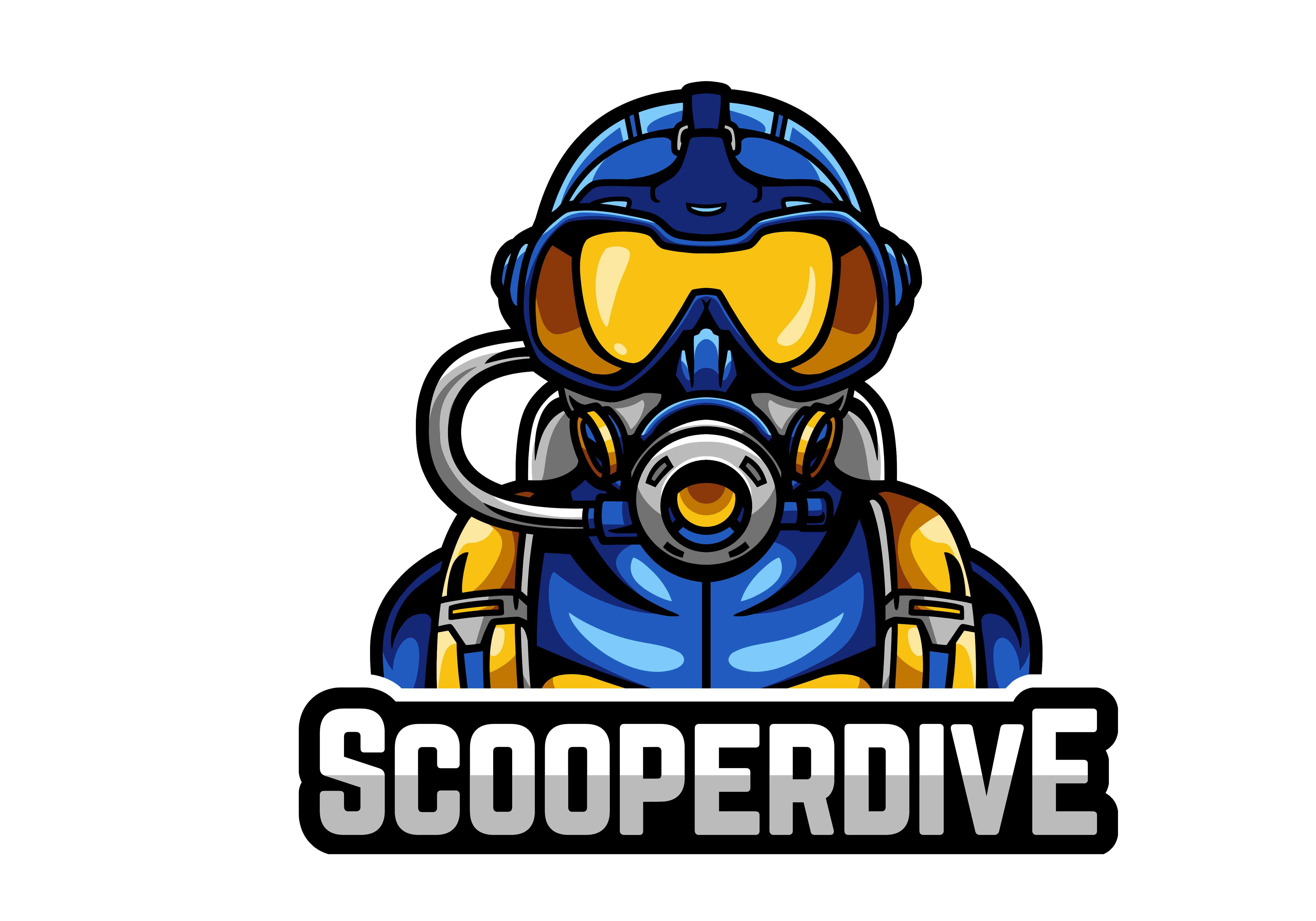
Logo Usage
Our Primary Logo
This is our one and only logo. To ensure its integrity, please adhere to the following rules:
- DO NOT edit, distort, or change the colors.
- DO NOT reconfigure or separate its elements.
- DO ensure there is adequate clear space around it.
- DO feel free to scale it up or down as needed, maintaining its aspect ratio.
Color Palette
Our brand colors are foundational to our identity. Use them to create a consistent visual experience across all materials.
Cobalt Blue
#0047AB
CMYK 100, 70, 0, 0
Slate Blue
#3A5569
CMYK 85, 58, 46, 15
Gold
#F0B84F
CMYK 0, 26, 81, 0
Silver
#C3C3C3
CMYK 0, 0, 0, 21
Orange
#CC7515
CMYK 0, 41, 87, 20
Imagery
Our brand imagery style is **cartoonish and adventurous**. It should evoke a sense of fun and exploration that defines the Scooperdive spirit.
Tone of Voice
Our communication is a blend of **technical, casual, and fun**. We aim to be knowledgeable without being intimidating, and engaging without being unprofessional.
Have Questions?
If you need further assistance with our branding, please don't hesitate to reach out. We're here to help!
Contact Us